Rêve Beauté
A skincare studio with a page for everything it sells
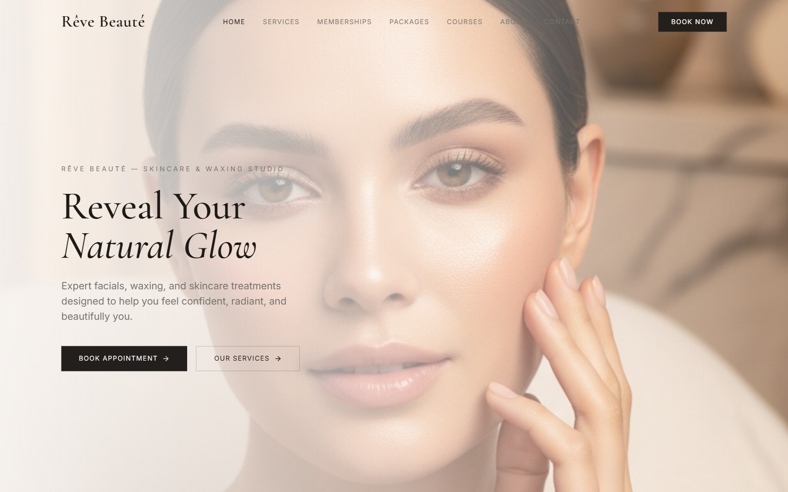
An eleven-page website for a skincare and waxing studio, with its treatments, memberships, packages and training courses each on a page of their own.
- Client
- Rêve Beauté
- Sector
- Beauty & skincare
- Services
- Web design, Web development
- Year
- 2026
01Overview
A skincare and waxing studio that sells far more than appointments.
Rêve Beauté is a studio for facials, waxing and skin treatments. Alongside single appointments it sells memberships, treatment packages, gift cards and training courses.
The website had to explain all of that clearly without burying the thing most visitors come for: booking a treatment.
- Eleven pages, plus a 404 page
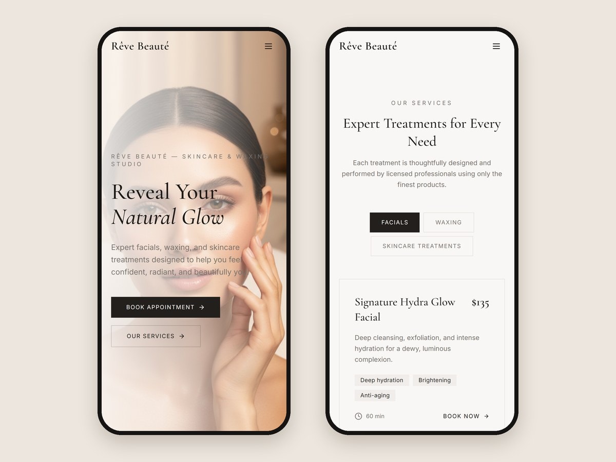
- A treatment menu of 12 treatments in three tabs
- Three membership tiers and four treatment packages
- A training courses page with a full syllabus for each course
- Reviews, an FAQ in four topics, deals and gift cards
- A static front end built with React, Vite and Tailwind
02The challenge
Four very different things to sell, and one button that matters most.
A facial is chosen on price, time and results. A membership is chosen on what it includes. A training course is chosen on level, class size and what the syllabus covers. Putting all of that on one page would have made every one of them harder to choose.
So each offer got a page of its own, laid out around the details people compare, and the Book Now button follows visitors from page to page.
03The treatment menu
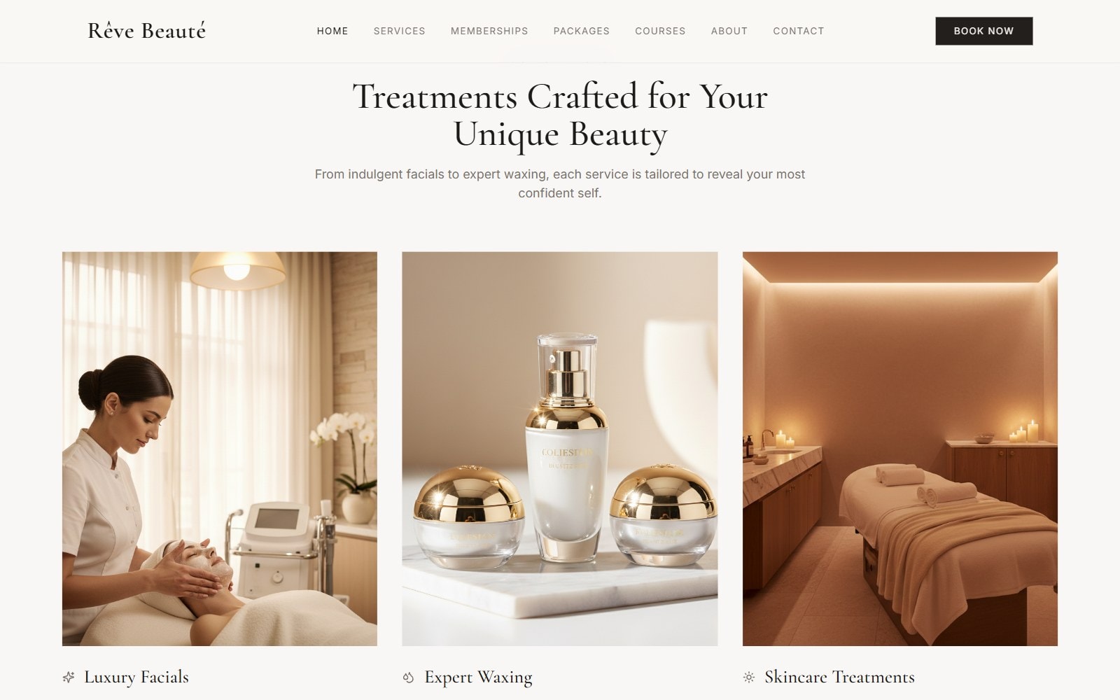
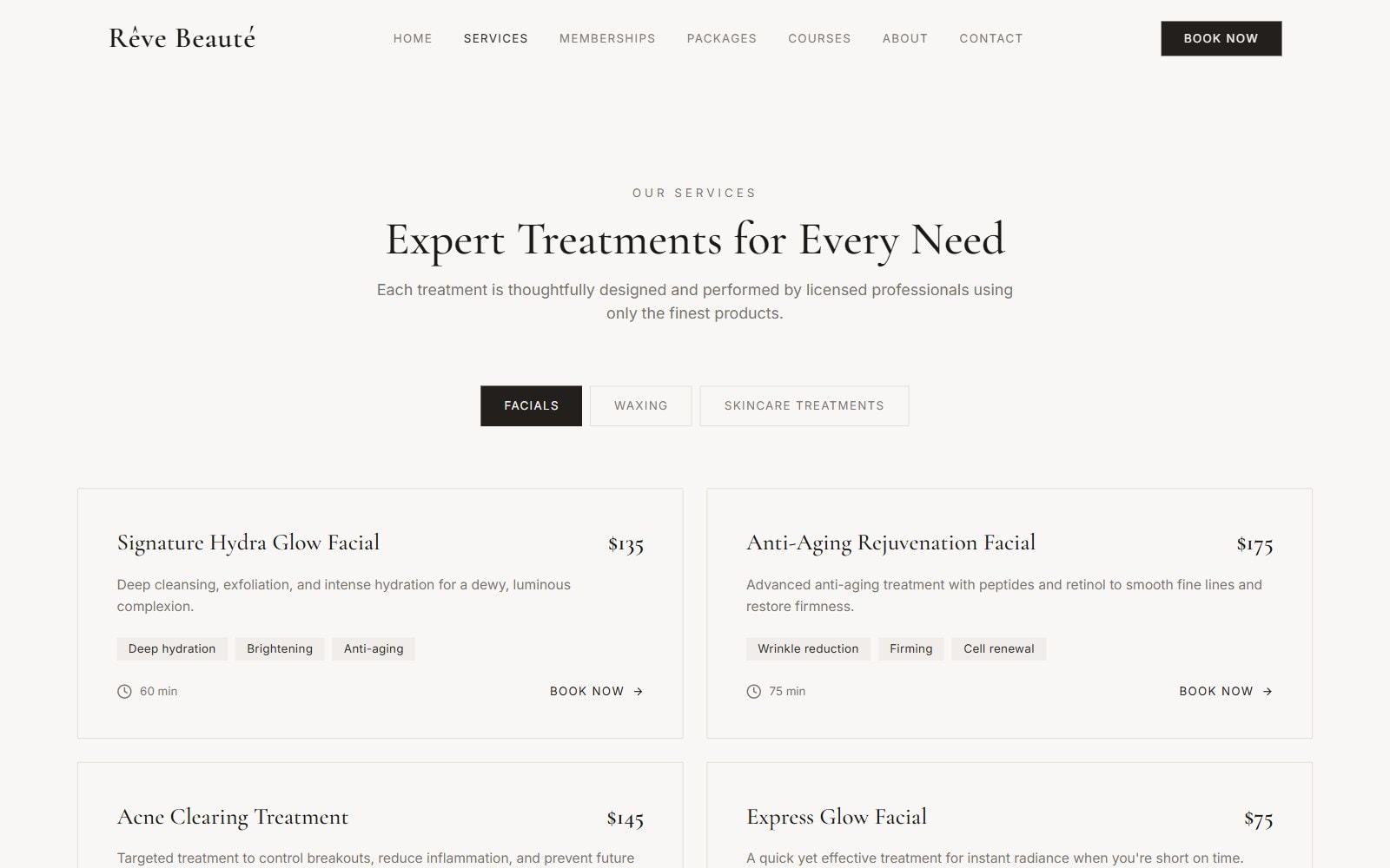
Twelve treatments in three tabs, each with its price, time and benefits.
The Services page splits the menu into Facials, Waxing and Skincare treatments. Every treatment shows its price, how long it takes and what it does, so a visitor can choose without having to ask.
04Memberships and packages
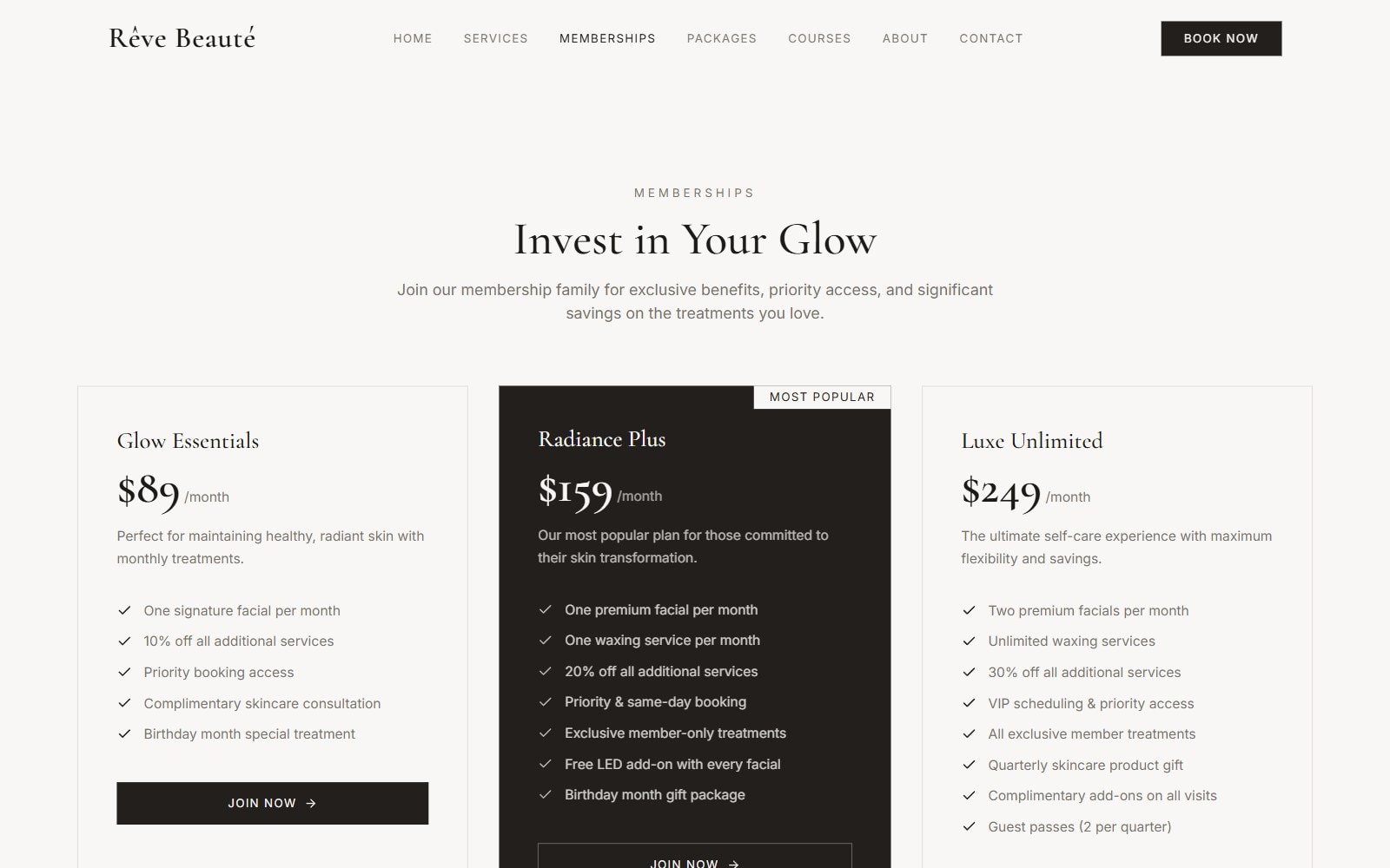
Three memberships, four packages, and a clear favourite.
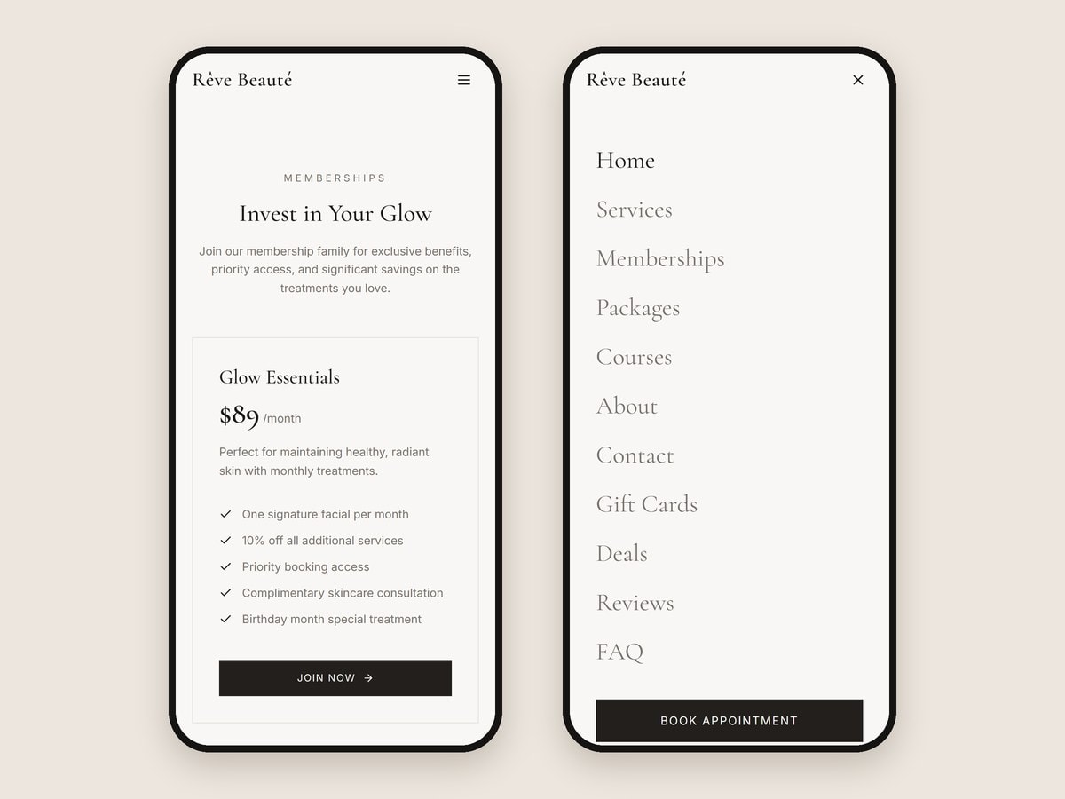
The three membership tiers sit side by side, with the most popular plan highlighted so the comparison has an obvious answer. Four treatment packages, a deals page and gift cards give visitors other ways in, each on a page of its own.
05Courses and answers
Training laid out like a prospectus, and answers before anyone has to ask.
The courses page lists four training courses, each with its level, length, class size, price and full syllabus.
A reviews page sits alongside an FAQ grouped into four topics: booking and appointments, treatments and services, memberships and payments, and before and after care.
06On the phone
The Book Now button is never more than a thumb away.
On desktop, Book Now sits in the navigation. On phones, a floating Book Now button appears once visitors start scrolling, and the menu opens full screen.
Every booking, membership and course button leads to the same appointment request form on the contact page, alongside the opening hours and a map.
07In numbers
Want results like these?
Tell us about your business and we will show you what a project like this would look like for you.